
Branding
- V Hoy

- Nov 4, 2018
- 6 min read

Branding... you gorgeous thing you! Professionally , not gonna lie... good design rocks my socks! I am passionate about branding. Truth be told, I have been known to drool over the odd bit of good packaging and a shmmmick speaker design every now and again!
Drool aside, I wanted to tackle building a visual representation of myself with great care. I had a real desire to make my brand a true personification of my identity in visuality. However... easier said than done.
I had one major problem with this concept. I had no identity of my own! Normally I guess when most people develop their brands, especially as an artist, there's real pride in that connecting your brand back into your whakapapa. Especially in New Zealand. But I have no real tribe I fell drawn to, no loyalties to last name or race, no iwi or solid connection to any one part of this country.
I am the daughter of immigrants. My mother hailing from England, her people a mottle of hidden germanic roots and deep Irish pride (some coal miners cockney thrown in for good measure). My fathers side of the family, I know pretty sketchy details around! My Grandmother, Fijian born and my Grandfather ferrying with pride his name, transjected from Scandinavian origins. However, I had nothing to do with my fathers side of my parentage and my mothers "stiff upper English lip" meant that that subject not to be discussed.
It was this very strange thing growing up.... to feel disconnected from the very DNA that complies you. Especially when your the white girl mocked for her big lips, wide nose and curly hair and torment came from both sides of that very real race divide that runs rampant through our country.
I guess it's what really formed my ideas around equality and "one speciesism". When you belong to nowhere, everywhere is home, everyone your family. Race, countries, money, poverty, yours and mine.... they stop meaning so much when you look at us all as equal. Call it liberal internationalism!
Same in like when it comes to the gender discussion. Now before every man reading this gets up in arms and wonders what the hell the sex discussion has to do with forming a brand, bare with me! I wanted my branding to be a symbol that represented a connection to my higher belonging to the human species, as well as being ambiguous in the sense that it didn't allude to my sex. In doing so, my hope was that it would leave my work free of any judgements and free of any disparages that knowing my sex, in turn, may bring. Like it or not fellas', men are far more respected, listened to and paid at higher rates than woman, especially within the creative sector, no matter how "progressive" we believe we are in the industry, the divide is very real. I don't want my work judged on first appearance for anything other than the credit of its own merit. RESEARCH

Sketches of Ancient Sumerian cuneiform
(unknown), Ascalone, E. (2007). Mesopotamia (p. 121). Berkeley: University of California Press
I wanted to create a universal tribalistic symbol that made no hit to my sex or race but spoke instead to a sense of oneness. In narrowing down the kinds of forms I was going to use within the brand, I spent a fair bit of time delving into ancient art types. Mainly looking at different hieroglyphs and cuneiform from all over the world. Truth be told, I perhaps spent far too much time researching archeological art forms, they're a secret love of mine. But in doing so I noticed a consistent pattern across all the different cultures artworks. No matter the origins, they all repeated circles and triangles as two of their most sacred symbols. These two simple forms hold so much depth and intrinsic meaning throughout every culture on Earth. They are the symbols for male and female, Earth and Heaven, balance and oneness, for the elements and the gods themselves. From Ancient Samaria and Egypt to the Aztec jungles and Inuit tribes of the deep pole, these symbols speak to the roots of every one of us no matter our birth place.

Native American Chumash tribe blanket band
Symbols, L., Symbol, N., Symbols, N., Index, N., Signs, S., & symbol, S. et al. (2018). Circle Symbol ***. Retrieved from https://www.warpaths2peacepipes.com/native-american-symbols/circle-symbol.htm

The Valknut on the Stora Hammars I stone, Gotland, Sweden
McCoy, D. The Viking spirit (p. 58).

Fijian Massi Tuttle, E. (2018). FUN FIJI FACTS 11. Retrieved from http://delightfuldepartures.blogspot.com/2010/07/fun-fiji-facts-11.html
Look truth be told there are so many levels of research to this wee little sucker that I could go on for days... I could tell you about the spiritual connection this symbolises for me, its connection to my own faith, the sacred geometry in it all, as well as a good whacking nod to a few conspiracy theories I may or may not have (cough cough "the Illuminati are nothing" cough cough "elite society and aliens" cough cough) , (thanks deep dark corners of the interweb rabbit holes I've spiralled down late on many a Friday night) but I won't.... not because I can't be bothered explaining it all but rather to hold on a bit to the private sanctity of its many deeper personal meanings to me. I will however, give you a little insight into some of the best bits that influenced the development of what is now my brand symbol.
DEVELOPMENT
I've played around with a few different designs over the last year. Notably of which making the decision to differentiate my brand mark from my signature. I wanted the two images to be able to converse with one another but also be a seperate entity in their own right.

A key choice with my signature was to keep it as ambiguous as my Branding... perhaps even more so. Choosing to neither directly name or date my work but instead to have a signature that changed from year to year. Once again feeding into the desire to not label myself and there for limit my work and its reception within some circles. When also thinking about my work (especially with in the Street Art scene) my imprint needed to be something easily stenciled and reproduced. Wanting both of the emblems to be quite graphic and clean in nature. This more so for design purposes and ability for the images to translate well on a variety of different mediums. Whether singed physically one my actual work, or on things such as merchandise. Changing my signature each year also gives me the ability to add a fresh graphic to the brand every year.
Eva Chen - director of fashion partnerships at Instagram, said "Build a lifestyle around your brand, and the audience will follow." I try to look at people within the industry that have really cracked it in their fields. I examine every aspect of their lives and what they have done to propel them to heights of success. Besides working your arse off night and day that is! One of the repeating themes I notice with these individuals is that they are ever keenly aware of their brand image. They target their social media markets with almost military precision. Every image and key stroke, every piece of merchandise and message stratagised to create not only maximum impact but also to feed into the kaupapa of the business that is you. I wanted to be vigilant in making sure I was doing exactly that when developing my brand. I do this even when considering my next art piece. I know that my brand is far more that a symbol... its everything I stand for and express through every single thing I do. So every move I make must feed back into everything else that I do. I really considered this long and hard when creating my brand. It forced me to really think about what my higher goals are and understanding that there is a passion side to my practise and a professional side but also that the two can work together.

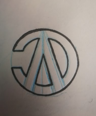
Clean lines, minimalism, high gloss and a sexy matt.... I'm all about it. So my own brand needed to be simple. This was also tied back into my research, most of the symbolism being very simplistic in nature. I work a lot in black and white, my favorite medium being black ink so felt I needed to keep the color pallet equally minimal. Because of my research and wanting to simplify my logo down to those core shapes, the actual design came together pretty quickly. And for those wondering, I only realised it was indeed my name upside down once I got it on the screen and started playing around with them. Happy coincidence, or universal fate who knows (insert x-files music here).
Initially I did try adding some more tribalistic looking forms - the additions of the lines and cross hatching (another repeating pattern in antiquities) however quickly scaled this back finding that it just over complicated the design more than necessary. This was instead linked in with negative space creating a break in the circle (this does have a higher intended meaning also but that one can remain my little closely kept treasure.) Then really it was just a case of moving onto line weight and experimenting with how sizing affected its impact and applying it to some different medium testing its viability as a brand. Making sure it could hold its own and be as impactful as I wanted it to be on a wide range of objects.


Comments